WCAG 2.1 AA Compliance Guide
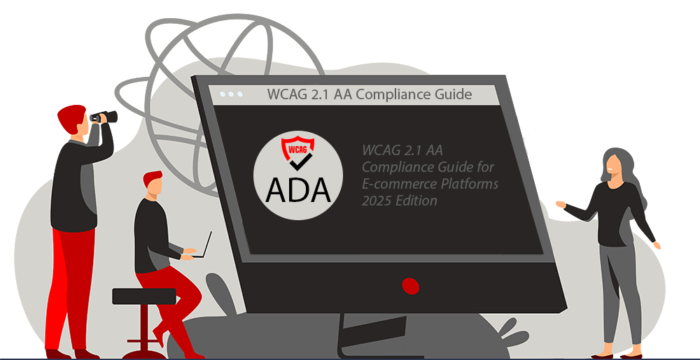
WCAG 2.1 AA Compliance Guide for E-commerce Platforms – 2025 Edition
A WCAG AA 2.1 compliant e-commerce platform is an online store designed and built to meet the Web Content Accessibility Guidelines (WCAG) 2.1 Level AA standards, ensuring that individuals with disabilities can access and use the platform effectively.
Building Accessibility In: The Foundation of Inclusive E-commerce
While addressing the specific requirements outlined below is essential, achieving true, lasting WCAG 2.1 AA compliance for your e-commerce platform requires a fundamental commitment to accessibility from the very beginning. In today’s digital landscape, eCommerce accessibility is no longer optional – it’s a legal requirement, a business imperative, and a fundamental aspect of ethical online commerce. But achieving comprehensive compliance goes far beyond simply adding an accessibility overlay to an existing website.
To truly protect your business, maximize your reach, and provide an inclusive experience for *all* potential customers, you need a solid foundation: an eCommerce platform *meticulously designed and built from the ground up* with accessibility as a core principle. This isn’t just about avoiding lawsuits; it’s about creating a welcoming and usable online store for everyone, ensuring that users of all abilities can seamlessly navigate, browse, find products, and complete purchases.
EnterpriStore offers a solution by providing an eCommerce platform built with WCAG 2.1 AA source code compliance as an integral part of its design. This proactive approach ensures that accessibility is not an afterthought, but a fundamental characteristic of the platform, minimizing the need for extensive remediation later and providing a genuinely inclusive experience from the outset.
Core Accessibility Requirements
Screen Reader Optimization: Implement comprehensive screen reader compatibility to ensure your e-commerce platform works seamlessly with popular assistive technologies, enabling visually impaired users to navigate and shop effectively.
Keyboard-First Navigation: Develop complete keyboard accessibility throughout the website, allowing users with motor disabilities to navigate all features without requiring mouse input.
Image Alt Text Implementation: Incorporate detailed, SEO-friendly alternative text for all images, product photos, and graphical elements, ensuring both accessibility compliance and improved search engine visibility.
WCAG 2.1 AA Color Contrast Standards: Maintain a minimum contrast ratio of 4.5:1 for normal text and 3:1 for large text, meeting WCAG 2.1 AA guidelines while enhancing visual accessibility.
Dynamic Text Scaling: Enable responsive text resizing functionality that maintains layout integrity when users adjust text size, supporting both accessibility needs and mobile responsiveness.
Accessible Form Design: Implement ARIA-labeled forms with clear error identification and keyboard-friendly input fields, especially crucial for checkout processes and user registration.
Enhanced Product Search Accessibility: Design accessible product filters and search functionality with ARIA landmarks and keyboard-operable controls, providing clear feedback for all user interactions.
Intuitive Site Architecture: Create a logical, hierarchical navigation structure that aids both users with cognitive disabilities and search engine crawlers in understanding your site’s organization.
Accessible E-commerce Checkout: Develop a fully compliant checkout process with proper form labeling, error handling, and step-by-step navigation support.
Multimedia Accessibility Features: Provide synchronized captions, audio descriptions, and transcripts for all multimedia content, enhancing both accessibility and SEO value.
Multi-Channel Support Access: Implement various customer support options including AI-powered chat, email support, and phone assistance to accommodate diverse user needs.
Clear Content Structure: Use semantic HTML and properly structured headings (H1-H6) to create easily navigable, SEO-optimized content that works well with assistive technologies.
Continuous Accessibility Testing: Maintain regular automated and manual accessibility testing protocols to ensure ongoing WCAG 2.1 AA compliance and optimal user experience.
Comprehensive Accessibility Documentation: Publish a detailed accessibility statement outlining compliance measures, known issues, and feedback channels for users to report accessibility concerns.
Screen Reader Optimization
Optimizing your e-commerce platform for screen reader compatibility is essential to ensure visually impaired users can navigate, interact with, and complete transactions seamlessly. Screen readers rely on well-structured, accessible code to interpret and convey website content effectively. Here’s a more detailed breakdown of how to achieve comprehensive screen reader optimization:
1. Use Semantic HTML for Meaningful Content Structure:
Purpose: Semantic HTML elements provide context for screen readers, allowing them to accurately interpret and convey the purpose of each element on the page.
Best Practices:
Use proper HTML tags for headings (`<h1>` to `<h6>`), lists (`<ul>` and `<ol>`), tables (`<table>`, `<thead>`, `<tbody>`), and landmarks (`<main>`, `<nav>`, `<footer>`).
Avoid using `<div>` and `<span>` for structural purposes unless absolutely necessary.
Example:
“`html
<header>
<h1>Welcome to Our Store</h1>
</header>
<main>
<section>
<h2>Featured Products</h2>
<ul>
<li>Product 1</li>
<li>Product 2</li>
</ul>
</section>
</main>
“`
2. Provide Descriptive Alternative Text for Images:
Purpose: Screen readers rely on `alt` attributes to describe images to visually impaired users. Without descriptive `alt` text, users may miss critical information.
Best Practices:
- Use clear, concise descriptions that convey the purpose or content of the image.
- For decorative images, use empty `alt=””` to prevent unnecessary interruptions for users.
- Avoid redundant phrases like “Image of” or “Picture of” in the description.
Example:
“`html <img src=”t-shirt.jpg” alt=”Red cotton t-shirt with round neck” />“`
3. Ensure Keyboard Accessibility:
Purpose: Many screen reader users rely on keyboard navigation to interact with websites. Ensuring all interactive elements are keyboard-accessible is critical.
Best Practices:
- Ensure all buttons, links, and form fields can be accessed using the `Tab` key.
- Use `aria-label` or `aria-labelledby` attributes to provide additional context for interactive elements when needed.
Example:
“`html <button aria-label=”Add Red T-Shirt to cart”>Add to Cart</button> “`
4. Use ARIA Roles and Attributes Thoughtfully:
Purpose: ARIA (Accessible Rich Internet Applications) roles and properties enhance accessibility by providing additional information about elements that may not be conveyed through HTML alone.
Best Practices:
- Use ARIA roles such as `role=”dialog”` for modals, `role=”menu”` for dropdowns, and `role=”alert”` for notifications.
- Avoid overusing ARIA when native HTML elements already provide sufficient accessibility.
Example:
“`html
<div role=”dialog” aria-labelledby=”dialog-title”>
<h2 id=”dialog-title”>Shopping Cart</h2>
<p>Your cart is empty.</p>
</div>
“`
5. Label Forms and Inputs Clearly:
Purpose: Screen readers rely on labels to identify form fields, ensuring users can complete tasks like searching or checking out without confusion.
Best Practices:
- Use `<label>` elements explicitly associated with form controls via the `for` attribute.
- Provide clear instructions and error messages for required fields or invalid input.
Example:
“`html
<label for=”email”>Email Address</label>
<input type=”email” id=”email” name=”email” required />
“`
6. Optimize Dynamic Content with ARIA Live Regions:
Purpose: Dynamic content, such as pop-ups or live notifications, should be announced to screen reader users without requiring them to manually locate updates.
Best Practices:
Use `aria-live=”polite”` or `aria-live=”assertive”` to notify users of changes in content dynamically (e.g., “Item added to cart”).
Example:
“`html
<div aria-live=”polite”>Item added to your cart</div>
“`
7. Test with Popular Screen Readers:
Purpose: Testing ensures your optimizations work as intended across different screen reader technologies.
Tools to Use:
NVDA (Windows)
JAWS (Windows)
VoiceOver (macOS/iOS)
TalkBack (Android)
By implementing these practices, your e-commerce platform will become more accessible to visually impaired users, enabling them to navigate your site, browse products, and complete purchases confidently and independently.
Keyboard-First Navigation
Developing complete keyboard accessibility is a cornerstone of creating an inclusive website. This ensures that users with motor disabilities, as well as those who rely on assistive technologies like screen readers, can navigate and interact with all features of the website without requiring mouse input. Here’s how to achieve effective keyboard-first navigation:
1. Logical Tab Order:
Ensure that the tab order follows a logical sequence, moving from top to bottom and left to right, as it appears visually on the page. This allows users to navigate through the website in a predictable manner. Avoid skipping essential elements or placing focus on hidden or irrelevant items.
2. Focus Indicators:
Provide visible focus indicators (such as outlines or highlights) for all interactive elements like buttons, links, and form fields. This ensures users can see which element is currently selected as they navigate using the `Tab` key. For example, use CSS to style focus states with `:focus` pseudo-classes to make navigation intuitive.
3. Skip Navigation Links:
Include “Skip to Content” or “Skip Navigation” links at the top of the page. These allow users to bypass repetitive navigation menus and jump directly to the main content, saving time and effort for keyboard users.
4. Accessible Menus:
Ensure dropdown menus, mega menus, and hamburger menus are fully navigable with the keyboard. Users should be able to open, close, and select menu items using the `Tab`, `Enter`, and arrow keys. Proper ARIA attributes (e.g., `aria-expanded` for toggling visibility) can help communicate menu states to assistive technologies.
5. Interactive Elements:
Forms: All form fields, radio buttons, checkboxes, and dropdowns should be accessible via the keyboard. Users should be able to move between fields using `Tab` and activate options with `Enter` or the spacebar.
Buttons and Links: Ensure all buttons and links can be activated with the `Enter` or spacebar keys. Avoid using custom elements that lack proper keyboard support.
6. Avoid Keyboard Traps:
Prevent situations where users become “trapped” within a specific section of the website (e.g., modals or pop-ups) without a way to exit or move forward. Use proper focus management techniques to return focus to the triggering element when closing a modal or overlay.
7. Test with Real Users:
Regularly test your website’s keyboard accessibility with real users who rely on keyboard navigation or assistive technologies. This will help identify pain points and ensure that all features are intuitive and functional without mouse input.
By prioritizing keyboard-first navigation, you not only enhance accessibility for users with motor disabilities but also improve usability for a wide range of visitors, including those who prefer keyboard shortcuts for efficiency.
Image Alt Text Implementation
Incorporating detailed, SEO-friendly alternative text (alt text) for all images, product photos, and graphical elements is a critical step toward creating an accessible website. Alt text not only ensures compliance with accessibility standards like WCAG (Web Content Accessibility Guidelines) but also enhances search engine visibility by providing context for images. Here’s how to effectively implement alt text:
1. Describe the Image Content Clearly:
- Write concise but descriptive alt text that conveys the purpose of the image. For example:
- Instead of “Shirt,” use “Blue cotton button-down shirt with long sleeves.”
- For decorative images, leave the alt attribute empty (`alt=””`) to avoid unnecessary distractions for screen reader users.
2. Contextual Relevance:
- Tailor the alt text to match the image’s context on the page. For example, a product image on an e-commerce site should include details like color, size, material, or unique features: “Red leather handbag with gold accents and adjustable strap.”
3. Avoid Redundancy:
- If the image is accompanied by a caption or nearby text that already describes it, avoid repeating the same information in the alt text. Instead, focus on adding value or context that isn’t already provided.
4. Include Keywords Strategically:
- Incorporate relevant keywords naturally into the alt text to improve SEO. For example, if the product is a “men’s running shoe,” include this keyword in the description without overloading it with unnecessary terms (e.g., “Men’s black running shoe with breathable mesh upper”).
5. Handle Complex Images Thoughtfully:
- For complex images like charts, graphs, or infographics, provide a brief summary in the alt text and include a more detailed description elsewhere on the page. For example:
- Alt text: “Bar chart showing quarterly sales growth from 2020 to 2025.”
- Detailed description: Add a longer explanation in text form below the chart or link to a separate page.
6. Don’t Overuse Alt Text for Decorative Images:
- For purely decorative images that don’t add meaningful content (e.g., background patterns or spacer graphics), use an empty alt attribute (`alt=””`) to ensure screen readers skip over them. This reduces unnecessary noise for users relying on assistive technologies.
7. Test with Screen Readers:
- Regularly test your website using popular screen readers like JAWS, NVDA, or VoiceOver to ensure that alt text is read aloud correctly and provides meaningful assistance to visually impaired users.
By implementing detailed and SEO-friendly alt text across your website, you can achieve a dual benefit: improving accessibility for users with visual impairments while boosting your website’s search engine rankings and discoverability.
WCAG 2.1 AA Color Contrast Standards
Maintaining proper color contrast is essential for ensuring that text and other visual elements on a website are easily readable by users with visual impairments, such as low vision or color blindness. Adhering to the WCAG 2.1 AA guidelines on color contrast not only improves accessibility but also enhances the overall usability of your website for all users. Here’s a detailed breakdown of how to meet these standards:
1. Minimum Contrast Ratios:
- Normal Text: Ensure a contrast ratio of at least 4.5:1 between the text and its background. This applies to body text, navigation links, and other standard-sized text elements.
- Large Text: For text that is 18pt (24px) or larger, or 14pt (18.66px) bold, a lower contrast ratio of 3:1 is acceptable. Large text is easier to read and requires less contrast for accessibility.
2. Contrast Testing Tools:
- Use tools to test color contrast and verify compliance with WCAG 2.1 AA standards:
- WebAIM Contrast Checker: Input foreground and background colors to check the contrast ratio.
- Accessible Color Generator: Suggests accessible color combinations for design elements.
- Browser Extensions: Tools like Axe or Lighthouse can automatically check for contrast issues on your site.
3. Avoid Reliance on Color Alone:
Do not use color as the sole means of conveying important information (e.g., red text for errors or green text for success). Pair colors with other indicators like icons, underlines, or bold text to ensure users with color vision deficiencies can still interpret the information.
4. Backgrounds and Overlays:
- Ensure that text placed over images, gradients, or patterns maintains the required contrast ratio. Use semi-transparent overlays or solid backgrounds behind text when necessary to improve readability.
- Avoid light gray or pastel-colored text on white backgrounds, as this often fails contrast requirements and is difficult to read for users with low vision.
5. Focus on Interactive Elements:
- Ensure that buttons, links, and other interactive elements meet the same contrast requirements as normal text (4.5:1).
- Pay special attention to hover states, active states, and disabled states of buttons or links to ensure they remain accessible in all conditions.
6. Dark Mode Considerations:
If your website includes a dark mode option, verify that all text and interactive elements in dark mode comply with WCAG 2.1 AA contrast ratios (e.g., light text on dark backgrounds).
7. Enhancing Usability Beyond Compliance:
While WCAG 2.1 AA sets minimum standards, consider going above and beyond by aiming for AAA compliance when possible (contrast ratio of 7:1 for normal text and 4.5:1 for large text). This further improves readability for users with severe visual impairments or in challenging lighting conditions.
By adhering to WCAG 2.1 AA color contrast standards, you not only meet accessibility requirements but also create a more inclusive experience for all users, ensuring that your website is usable regardless of visual ability or environmental factors such as screen glare or poor lighting conditions.
Dynamic Text Scaling
Implementing dynamic text scaling ensures that users can adjust text size without compromising the overall layout or usability of your website. This feature is critical for accessibility, as it allows individuals with visual impairments or reading difficulties to customize their viewing experience. At the same time, it supports mobile responsiveness, ensuring a seamless experience across all devices. Here’s how dynamic text scaling enhances accessibility and usability:
1. Empower Users with Visual Impairments:
- Customizable Text Sizes: Dynamic text scaling allows users to increase or decrease font sizes to suit their specific needs, making content easier to read for individuals with low vision or age-related visual impairments.
- Support for Assistive Tools: This functionality works seamlessly with built-in device features like text resizing settings on iOS and Android, ensuring compatibility with user preferences.
2. Maintain Layout Integrity Across Devices:
- Responsive Design: Proper implementation of dynamic text scaling ensures that increasing text size does not break the layout or cause overlapping elements, preserving the usability of the site.
- Flexible Grid Systems: By using responsive design techniques such as fluid grids, scalable typography (e.g., using relative units like `em` or `rem`), and flexible containers, your site can adapt to increased text sizes without disrupting the user experience.
3. Enhance Mobile Accessibility:
- Device Compatibility: Mobile users often rely on text scaling features to improve readability on smaller screens. Dynamic text scaling ensures your site remains functional and visually appealing when accessed on various devices.
- WCAG Compliance: WCAG 2.1 guidelines recommend that users be able to resize text up to 200% without losing functionality or content, which is especially important for mobile and tablet users.
4. Improve Readability for All Users:
- Universal Benefit: While dynamic text scaling is essential for users with disabilities, it also improves the experience for those without disabilities, such as users in poor lighting conditions or those who prefer larger fonts for comfort.
- Typography Best Practices: Pairing dynamic text scaling with accessible font choices (e.g., sans-serif fonts) and proper line spacing ensures optimal readability for everyone.
5. Technical Implementation Tips:
- Relative Units: Use relative font sizes (e.g., `em`, `rem`, or percentages) instead of fixed units like `px` to allow for scalability.
- Media Queries: Implement CSS media queries to adjust layouts and ensure that increased font sizes do not disrupt the design on different screen sizes.
- Test Across Scenarios: Regularly test your site’s text resizing functionality to confirm that all content remains accessible and that no elements overlap or become hidden.
By enabling dynamic text scaling, you create a more inclusive and user-friendly website that meets accessibility standards while enhancing the experience for all visitors, regardless of their device or individual needs.
Accessible Form Design:
Designing accessible forms is critical for ensuring that all users, including those with disabilities, can successfully complete tasks like checkout processes, user registration, and other essential interactions. By implementing ARIA-labeled forms, clear error identification, and keyboard-friendly input fields, you create a seamless and inclusive experience. Here’s a more detailed breakdown:
1. Use Semantic HTML for Form Elements:
- Use native HTML elements like `<label>`, `<input>`, `<select>`, and `<textarea>` to ensure compatibility with assistive technologies like screen readers.
- Associate each form field with its label using the `for` attribute (e.g., `<label for=”email”>Email Address</label>`). This ensures that screen readers correctly identify the purpose of each input field.
2. Implement ARIA Attributes for Enhanced Accessibility:
Use ARIA attributes sparingly and only when native HTML elements cannot achieve the desired functionality.
Examples include:
- ‘aria-labelledby’ or ‘aria-label’: Provide accessible names for form fields if a visible label isn’t present.
- ‘aria-describedby’: Link input fields to additional instructions or error messages for better context.
- ‘aria-required=”true”‘: Indicate required fields explicitly to assistive technologies.
- Avoid overusing ARIA where native HTML elements suffice, as this can lead to unnecessary complexity.
3. Provide Clear Error Identification:
Ensure that error messages are easy to locate and understand, especially for users relying on screen readers. Best practices include:
- Dynamically updating error messages as users interact with the form (e.g., when a required field is left empty).
- Using clear, concise, and actionable language for errors (e.g., “Please enter a valid email address” instead of “Invalid input”).
- Associating error messages with their corresponding fields using `aria-described by` or similar techniques.
- Consider using inline error validation to provide real-time feedback without requiring users to submit the form first.
4. Make Forms Keyboard-Friendly:
- Ensure all form elements can be accessed and interacted with using just the keyboard:
- Users should be able to navigate between fields using the `Tab` key and activate buttons with the `Enter` or spacebar keys.
- Avoid using custom widgets that lack proper keyboard support unless you provide alternative navigation methods.
5. Include Visual and Textual Cues:
- Pair visual indicators (e.g., red borders or icons) with textual explanations for errors to accommodate users with color blindness or those relying on screen readers. For example:
- Use both a red outline and a message like “This field is required” to indicate an issue.
6. Support Autofill and Input Assistance:
- Enable browser autofill by using appropriate HTML attributes like `autocomplete=”email”`, `autocomplete=”name”`, etc., to reduce the effort required to complete forms.
- Provide input masks or hints (e.g., “MM/DD/YYYY” for date fields) to guide users in entering data correctly without frustration.
7. Optimize for Mobile Accessibility:
Ensure form fields are large enough to tap easily on touchscreens and include appropriate input types (e.g., `type=”email”`, `type=”tel”`) to bring up device-specific keyboards for faster input.
8. Test with Assistive Technologies:
Regularly test forms with screen readers (e.g., NVDA, JAWS, VoiceOver) and other assistive tools to ensure proper labeling, navigation, and error handling work as expected.
By following these principles, you can create forms that are not only accessible but also user-friendly, ensuring that all users can complete essential tasks without barriers.
Enhanced Product Search Accessibility
Designing accessible product search and filtering functionality is crucial for creating an inclusive e-commerce experience. By integrating ARIA landmarks, keyboard-operable controls, and providing clear feedback for user interactions, you ensure that all users, including those with disabilities, can efficiently search for and filter products. Here’s a more detailed breakdown:
1. Use ARIA Landmarks for Navigation:
Implement ARIA landmarks (e.g., `role=”search”`, `role=”region”`, or `role=”complementary”`) to help users of screen readers quickly locate and interact with search and filter sections.
Example:
Wrap the search bar and filters in a `<div>` with `role=”search”` to explicitly define the section for assistive technologies.
2. Provide Keyboard-Operable Controls:
Ensure that all search and filter functionality can be operated using only the keyboard, without requiring a mouse.
Best practices include:
- Allow users to navigate through filter options using the `Tab` key and select them with the `Enter` or spacebar keys.
- For dropdown filters, ensure users can open and close menus using the keyboard and cycle through options with the arrow keys.
- Use focus indicators (e.g., outlines or highlights) to show which element is currently active, making navigation easier for keyboard users.
3. Design Accessible Filter Options:
- Use appropriate form controls for filter options, such as checkboxes for multi-select filters, radio buttons for single-select filters, and sliders with accessible labels for range filters (e.g., price ranges).
- Provide descriptive labels for each filter option so users understand their purpose. For example, instead of “Color,” use “Filter by Color.”
- Group related filters with `<fieldset>` and `<legend>` elements to provide additional context to assistive technologies.
4. Provide Clear Feedback for User Interactions:
- Offer real-time feedback when users apply or remove filters, ensuring they know their actions were successful. For example:
- Display a message like “5 products found” after applying a filter.
- Use ARIA live regions (`aria-live=”polite”`) to announce updates dynamically to screen readers.
- Highlight active filters visually (e.g., bold text or colored backgrounds) and allow users to easily remove them with a clear “Remove Filter” button.
5. Implement Accessible Search Suggestions:
If your search bar includes autocomplete suggestions, ensure they are fully accessible:
- Use ARIA roles like `role=”listbox”` for the suggestion dropdown and `role=”option”` for individual suggestions.
- Ensure suggestions are navigable using the arrow keys and selectable with the `Enter` key.
- Announce the number of suggestions dynamically using ARIA live regions (e.g., “5 suggestions available”).
6. Avoid Overloading Users with Filters:
For complex filtering systems, provide a collapsible or expandable interface to reduce cognitive overload while maintaining accessibility. Ensure these controls are operable via keyboard and labeled appropriately (e.g., “Expand Filters” or “Collapse Filters”).
7. Test Across Assistive Technologies:
- Regularly test your product search and filtering functionality with screen readers (e.g., NVDA, JAWS) and keyboard navigation to ensure compatibility and usability.
- Validate that all ARIA attributes are correctly implemented and do not conflict with native HTML semantics.
By following these practices, you create an accessible product search experience that allows all users to efficiently find what they need, regardless of their abilities or devices.
Intuitive Site Architecture:
Designing an intuitive site architecture is essential for creating a website that is easy to navigate for all users, including those with cognitive disabilities, as well as optimizing it for search engine crawlers. A logical, hierarchical organization ensures that users can find content efficiently while enabling assistive technologies and search engines to interpret the site’s structure effectively. Here’s a more detailed breakdown:
1. Logical and Hierarchical Navigation Structure:
- Organize your website content into a clear, logical hierarchy:
- Use primary navigation menus for top-level categories (e.g., “Home,” “Products,” “About Us”).
- Group related subcategories under their respective parent categories (e.g., “Men’s Clothing” under “Clothing”).
- Limit the depth of navigation to no more than 3-4 levels deep to avoid overwhelming users and ensure content remains easy to locate.
2. Consistent Navigation Across Pages:
- Ensure the navigation menu is consistent across all pages to provide users with a predictable and reliable way to move through the site.
- Use a breadcrumb trail to show users their current location in the site hierarchy and provide a quick way to navigate back to higher-level categories.
3. Accessible Menus and Links:
- Design menus that are accessible to both keyboard users and screen readers:
- Ensure dropdown menus are keyboard-operable, allowing users to navigate through menu items using the `Tab` and arrow keys.
- Use ARIA roles (e.g., `role=”menu”`, `role=”menuitem”`) and attributes like `aria-expanded` to provide context for assistive technologies.
- Provide descriptive link text (e.g., “View Product Details” instead of “Click Here”) to help users understand where each link will take them.
4. Use Headings to Define Structure:
Use semantic HTML headings (`<h1>`, `<h2>`, `<h3>`, etc.) to outline the site’s structure clearly. Headings should follow a logical order, helping users with screen readers or cognitive disabilities understand the page’s content hierarchy.
Example:
‘<h1>’: Page title (e.g., “Men’s Clothing”)
‘<h2>’: Subcategories (e.g., “Shirts,” “Pants”)
‘<h3>’: Individual items or details within subcategories
5. Provide Search Functionality:
- Include a prominently placed search bar on every page to allow users to quickly locate specific content.
- Ensure the search functionality is accessible by:
- Adding a clear label (e.g., “Search this site”).
- Supporting keyboard navigation and voice input.
- Providing suggestions or autocomplete options for common queries.
6. Optimize for Cognitive Disabilities:
- Avoid overloading pages with too much information or too many navigation options. Break content into smaller, digestible sections.
- Use clear and simple language in navigation labels and headings to reduce cognitive load. For example, instead of “Explore Our Wide Range of Products,” use “Shop Products.”
7. Sitemap for Users and Crawlers:
- Create an HTML sitemap that provides an overview of your site’s structure, making it easier for users with cognitive disabilities to locate information.
- Include an XML sitemap for search engines to ensure all pages are indexed properly and reflect the site’s hierarchy accurately.
8. Test Navigation Usability:
Conduct usability testing with individuals who have cognitive disabilities or use assistive technologies to ensure your navigation structure is intuitive and functional.
By implementing these strategies, you create a website that is not only accessible but also user-friendly and optimized for search engines, benefiting all visitors.
Accessible E-commerce Checkout
Creating an accessible e-commerce checkout process is essential for ensuring that all users, including those with disabilities, can complete their purchases with ease. By incorporating proper form labeling, error handling, and step-by-step navigation support, you provide an inclusive and user-friendly experience. Here’s a more detailed breakdown:
1. Proper Form Labeling:
- Ensure all form fields have clear and descriptive labels that are programmatically associated with their corresponding inputs using the `for` attribute (e.g., `<label for=”email”>Email Address</label>`). This helps users relying on screen readers understand the purpose of each field.
- Include placeholder text only as supplementary information, not as a replacement for labels, since placeholders can disappear when users type.
Example:
“`html
<label for=”card-number”>Credit Card Number</label>
<input id=”card-number” type=”text” name=”card-number” required>
“`
2. Accessible Error Handling:
- Provide clear, actionable error messages that are easy to understand and locate. For example, instead of saying “Invalid input,” use “Please enter a valid email address.”
- Dynamically associate error messages with their respective fields using `aria-describedby`, so screen readers can announce the errors.
- Use visual cues (e.g., red borders or icons) along with text to indicate errors for users with color blindness or other visual impairments.
Example:
“`html
<label for=”email”>Email Address</label>
<input id=”email” type=”email” name=”email” aria-describedby=”email-error” required>
<span id=”email-error” class=”error-message”>Please enter a valid email address.</span> “`
3. Step-by-Step Navigation Support:
- Break the checkout process into manageable steps (e.g., shipping details, payment information, order review) and clearly indicate the current step in the process.
- Use a progress indicator to show users where they are in the checkout flow and how many steps remain.
- Allow users to navigate backward to previous steps without losing their entered data.
4. Keyboard Accessibility:
- Ensure that all interactive elements, such as dropdowns, radio buttons, and checkboxes, are fully operable using only the keyboard. Users should be able to navigate through the checkout process using the `Tab` key and activate options with the `Enter` or spacebar keys.
- Provide a visible focus indicator (e.g., an outline) to show which element is currently active during navigation.
5. Mobile and Touch Accessibility:
- Design touch-friendly elements, such as buttons and form fields, with sufficient size and spacing to avoid accidental taps.
- Ensure that inputs like credit card fields automatically display the appropriate keyboard on mobile devices (e.g., numeric keypad for card numbers).
6. Assistive Technology Compatibility:
- Use ARIA roles and attributes where necessary, such as `role=”alert”` to announce error messages or `aria-live=”polite”` for dynamic updates like changes in shipping costs or total price.
- Ensure compatibility with screen readers by testing the checkout process with popular tools like NVDA, JAWS, or VoiceOver.
7. Save User Progress:
For longer checkout processes, allow users to save their progress and return later without losing entered information, especially for users who may need more time due to cognitive or physical disabilities.
8. Avoid Time Constraints:
Avoid imposing strict time limits on completing the checkout process, as this can create barriers for users who require additional time. If timeouts are necessary (e.g., for security reasons), provide warnings and options to extend the session.
By implementing these best practices, you ensure a smooth and accessible checkout experience that accommodates all users, reduces abandonment rates, and aligns with accessibility standards like WCAG 2.1.
Multimedia Accessibility Features
Ensuring multimedia accessibility is critical for creating an inclusive experience for users with disabilities, including those who are deaf, hard of hearing, blind, or have low vision. By providing synchronized captions, audio descriptions, and transcripts, you not only make your content accessible but also improve your site’s SEO value by offering additional text-based content for search engines to index. Here’s a more detailed breakdown:
1. Synchronized Captions:
Purpose: Captions provide text versions of spoken dialogue and important audio cues, benefiting users who are deaf or hard of hearing.
Implementation Tips:
- Ensure captions are synchronized with the audio and displayed in real-time.
- Include non-speech elements like [laughter], [applause], or [music playing] to convey the full context of the audio.
- Use tools like YouTube’s caption editor or third-party software to create accurate captions.
- For live streams, provide real-time captions using CART (Communication Access Realtime Translation) services.
Example:
In a video tutorial, captions should display both the speaker’s words and sound effects: “`
[Instructor] First, click the “Submit” button on the top right.
[Sound effect: Mouse click] “`
2. Audio Descriptions:
Purpose: Audio descriptions narrate visual elements of a video (e.g., actions, scene changes, or text on the screen) for users who are blind or have low vision.
Implementation Tips:
- Create audio description tracks that explain visual content without overlapping with dialogue.
- If the video has pauses, use those moments to insert descriptions (e.g., “The man walks across a crowded street.”).
- Offer an alternative version of the video with integrated audio descriptions if the original does not have space for them.
3. Transcripts:
Purpose: Transcripts provide a text-based version of all multimedia content, including both spoken words and descriptions of visual/audio elements, making the content accessible for users who cannot watch or listen to the media.
Implementation Tips:
- For videos, include both dialogue and descriptions of key visual elements in the transcript.
- For audio content like podcasts, provide a verbatim transcript of the conversation along with any relevant background sounds or cues.
- Place transcripts directly on the page where the multimedia is embedded to improve SEO and make it easy for users to find.
Example Transcript for a Video:
“`
[Opening Scene: A sunny park with children playing.]
[Narrator] Welcome to our guide on outdoor activities!
[Sound effect: Birds chirping]
“`
4. Accessibility Standards Compliance:
Ensure all multimedia content meets WCAG 2.1 AA guidelines, which specifically address multimedia accessibility through requirements like:
- 1.2.2 Captions (Prerecorded): Captions must be provided for all prerecorded video content with audio.
- 1.2.5 Audio Descriptions (Prerecorded): Audio descriptions must be provided for all prerecorded video content with visual information.
5. Enhance SEO Value:
- Providing captions, transcripts, and audio descriptions not only improves accessibility but also boosts your site’s SEO by offering additional keyword-rich content that search engines can index.
- Use structured data (e.g., Schema.org’s `VideoObject`) to markup multimedia content and its associated captions/transcripts, making it easier for search engines to understand and rank your content.
By implementing these features, you ensure that multimedia content is accessible to a diverse audience while improving user engagement and discoverability.
Multi-Channel Support Access
Providing multi-channel support access is essential for making your website more accessible and inclusive, ensuring that users with diverse needs, abilities, and preferences can easily get assistance. By offering a variety of support options—such as AI-powered chat, email support, and phone assistance—you accommodate users with different communication styles, disabilities, and technological access. Here’s a more detailed breakdown:
1. AI-Powered Chat Support:
Purpose: AI-powered chatbots provide instant, 24/7 assistance, which is especially helpful for users who need quick answers or have difficulty using other communication methods.
Accessibility Features to Include:
- Ensure the chatbot is keyboard-navigable, allowing users to interact without a mouse.
- Enable compatibility with screen readers by using ARIA roles and labels (e.g., `role=”dialog”` and `aria-live=”polite”`) so assistive technologies can announce chatbot responses.
- Provide text-based responses in simple, clear language to accommodate users with cognitive disabilities or limited language proficiency.
- Allow users to escalate to a human agent if the chatbot cannot resolve their issue.
2. Email Support:
Purpose: Email support is ideal for users who prefer asynchronous communication or need to provide detailed information about their issue.
Accessibility Considerations:
- Ensure the email form on your website is fully accessible:
- Use proper form labeling for fields (e.g., “Name,” “Email Address,” “Message”).
- Provide clear error messages if required fields are left blank or invalid information is entered.
- Offer plain text email responses for users who rely on screen readers or have limited internet bandwidth.
3. Phone Assistance:
Purpose: Phone support is vital for users who prefer verbal communication or require personalized, real-time assistance. It’s particularly helpful for those with visual impairments or limited literacy skills.
Accessibility Features to Consider:
- Provide TTY (Text Telephone) or relay services for individuals who are deaf or hard of hearing.
- Train customer service representatives to handle calls from users with speech disabilities or those using assistive communication devices.
4. Additional Multi-Channel Considerations:
- Live Chat with Human Agents: Offer live chat as an alternative to AI-powered chat, ensuring users can connect with a human if needed.
- Social Media Support: Provide customer support through accessible platforms like Twitter, Facebook Messenger, or WhatsApp for users who prefer these channels.
- Help Center or FAQ Section: Create an accessible self-help section with clear navigation, search functionality, and content written in plain language to support users who prefer finding answers independently.
By offering diverse support options and ensuring each channel is fully accessible, you create a more inclusive experience that meets the needs of all users, regardless of their abilities or preferences.
Clear Content Structure:
Creating a clear content structure is fundamental to making your website accessible to all users, including those relying on assistive technologies like screen readers. By using semantic HTML and properly structured headings (H1-H6), you ensure that your content is logically organized, easy to navigate, and optimized for SEO. Here’s a more detailed explanation:
1. Use Semantic HTML for Meaningful Structure:
Purpose: Semantic HTML elements (e.g., `<header>`, `<main>`, `<article>`, `<section>`, `<footer>`) provide context and meaning to the content, making it easier for assistive technologies and search engines to understand.
Best Practices:
- Use elements like `<nav>` for navigation menus, `<aside>` for complementary content, and `<section>` for grouping related content.
- Avoid using non-semantic elements like `<div>` or `<span>` for structural purposes unless absolutely necessary.
- Ensure each page has one `<main>` element to define the primary content area.
Example:
“`html
<header>
<h1>Welcome to Our Website</h1>
</header>
<main>
<section>
<h2>Our Products</h2>
<p>Explore our wide range of items.</p>
</section>
<aside>
<h3>Special Offers</h3>
<p>Check out our latest discounts!</p>
</aside>
</main>
<footer>
<p>© 2025 Company Name</p>
</footer>
“`
2. Properly Structured Headings (H1-H6):
Purpose: Headings create a logical hierarchy that helps users, especially those using screen readers—understand the structure of the page and navigate efficiently.
Best Practices:
- Use a single `<h1>` per page to define the main topic or title.
- Organize subtopics with `<h2>` through `<h6>` in descending order of importance, maintaining a logical flow.
- Avoid skipping heading levels (e.g., jumping from `<h2>` to `<h4>`), as this can confuse users and disrupt the content hierarchy.
Example:
“`html
<h1>About Us</h1>
<h2>Our Mission</h2>
<p>We aim to provide the best services.</p>
<h3>Core Values</h3>
<p>Integrity, innovation, and excellence.</p>
“`
3. Benefits for Assistive Technologies:
- Screen readers use semantic HTML and headings to create a navigable “outline” of the page, allowing users to jump directly to sections of interest.
- Properly structured headings make it easier for users with cognitive disabilities to process and understand the page’s content.
4. SEO Optimization Benefits:
- Search engines prioritize content that is well-structured with semantic HTML and headings, improving your site’s ranking.
- Descriptive headings with relevant keywords enhance discoverability while maintaining accessibility for all users.
By combining semantic HTML and structured headings, you create a website that is both user-friendly and optimized for accessibility and search engines.
Continuous Accessibility Testing
Maintaining continuous accessibility testing is crucial to ensuring your website remains inclusive and compliant with standards like WCAG 2.1 AA while delivering an optimal user experience for everyone. Accessibility is not a one-time task; it requires regular evaluation and updates to adapt to new content, technologies, and user needs.
1. Regular Automated Testing:
Purpose: Automated tools quickly identify common accessibility issues such as missing alt text, improper heading structure, or insufficient color contrast.
Best Practices:
- Use automated testing tools like axe, WAVE, Lighthouse, or Includia to scan your website for accessibility violations.
- Integrate these tools into your development workflow (e.g., CI/CD pipelines) to catch issues early during the development process.
- Remember that automated tools can only detect about 30-50% of accessibility issues, so they should complement—not replace—manual testing.
2. Manual Testing Protocols:
Purpose: Manual testing ensures that real-world user experiences are considered, addressing issues automated tools may miss, such as keyboard navigation or screen reader compatibility.
Best Practices:
- Test your website with popular screen readers like NVDA, JAWS, or VoiceOver to ensure compatibility.
- Verify keyboard-only navigation by ensuring all interactive elements (e.g., buttons, links, forms) are reachable and operable using the `Tab`, `Enter`, and `Space` keys.
- Simulate different user scenarios, such as navigating with a screen magnifier or using high-contrast mode.
3. WCAG 2.1 AA Compliance Checks:
Purpose: WCAG 2.1 AA outlines the essential guidelines for creating accessible web content, covering areas like perceivability, operability, understandability, and robustness.
Best Practices:
- Regularly review your website against WCAG 2.1 AA criteria, such as:
- Providing text alternatives for non-text content (e.g., images, videos).
- Ensuring sufficient color contrast (minimum 4.5:1 for text).
- Making all functionality accessible via a keyboard.
- Avoiding content that causes seizures or physical reactions (e.g., flashing elements).
- Stay updated on new accessibility standards and guidelines to ensure ongoing compliance.
4. User Testing with People with Disabilities:
Purpose: Involving real users with disabilities provides invaluable insights into how accessible your website truly is and highlights usability issues that might go unnoticed otherwise.
Best Practices:
- Partner with accessibility organizations or recruit users with diverse disabilities (e.g., visual, auditory, motor, and cognitive impairments) for usability testing sessions.
- Observe how users interact with your website and gather feedback on areas of improvement.
5. Ongoing Monitoring and Maintenance:
Purpose: Accessibility is an ongoing process that requires vigilance as your website evolves with new content, features, and updates.
Best Practices:
- Schedule periodic accessibility audits (e.g., quarterly or biannually) to identify and fix new issues that arise over time.
- Train your team (designers, developers, content creators) on accessibility best practices to prevent introducing new barriers during updates.
- Keep a detailed log of accessibility issues and track their resolution over time to demonstrate progress and accountability.
By combining automated tools, manual testing, and user feedback, continuous accessibility testing ensures that your website remains both compliant with WCAG standards and welcoming to all users—regardless of their abilities.
Comprehensive Accessibility Documentation
Publishing a comprehensive accessibility statement is a crucial step in demonstrating your commitment to inclusivity and transparency. It provides users with clear information about your website’s accessibility efforts, compliance status, and ways to seek assistance or report barriers they encounter. Here’s an expanded explanation:
1. Accessibility Statement Overview:
Purpose: An accessibility statement communicates your organization’s dedication to creating an inclusive digital experience for all users, including those with disabilities.
Key Elements to Include:
- A declaration of commitment to accessibility and inclusivity.
- A summary of the accessibility standards your website adheres to, such as WCAG 2.1 AA or local regulations (e.g., ADA in the U.S., EN 301 549 in the EU).
- A clear statement about the scope of accessibility efforts (e.g., “This statement applies to all pages on this domain”).
Example:
“We are committed to ensuring digital accessibility for people with disabilities. We are continually improving the user experience for everyone and applying the relevant accessibility standards.”
2. Compliance Measures:
Purpose: Outline the specific steps you’ve taken to ensure compliance with accessibility standards.
Details to Include:
- The use of manual and automated testing protocols to identify and fix accessibility issues.
- Implementation of accessible design practices, such as semantic HTML, keyboard navigation, and sufficient color contrast.
- Ongoing staff training on accessibility best practices to ensure continuous improvement.
3. Known Issues:
Purpose: Acknowledge any current accessibility limitations or barriers that may exist on your website, demonstrating transparency and accountability.
Best Practices:
- Clearly describe the areas of the website where accessibility issues are known (e.g., “Some older PDF documents may not be fully accessible to screen reader users”).
- Provide a timeline or plan for resolving these issues, if possible.
Example:
“We are aware that some images on our website are missing alternative text descriptions. We are actively working to address this issue and aim to have it resolved by [specific date].”
4. Feedback Channels for Reporting Issues:
Purpose: Empower users to report accessibility barriers they encounter so you can address them promptly.
Details to Include:
- Provide multiple contact options, such as an email address, phone number, or feedback form, ensuring these channels are accessible.
- Specify response times for inquiries (e.g., “We aim to respond to all accessibility-related feedback within 48 hours”).
Example:
“If you encounter any accessibility barriers on our website, please contact us:
Email: accessibility@yourwebsite.com
Phone: +1-800-123-4567 (TTY available)
Feedback Form: [Insert link]”
5. Regular Updates and Maintenance:
Purpose: Reassure users that the accessibility statement is a living document that reflects ongoing improvements.
Details to Include:
A commitment to regularly review and update the statement as new issues are identified or resolved.
The date of the most recent update to the accessibility statement.
Example:
“This accessibility statement was last updated on Month, xx, 20xx. We will continue to review and improve our accessibility practices regularly.”
By publishing a detailed and transparent accessibility statement, you not only comply with legal requirements but also foster trust and goodwill among your users, demonstrating that their needs are a priority.
Ready to Make Your eCommerce Site Truly Accessible and Inclusive?
Learn how our ecommerce solution ensures accessibility and meets industry standards
Request a demo to see how Equally AI enhances accessibility and user experience
Contact us today for a comprehensive quotation to make your ecommerce or WordPress site WCAG 2.1 compliant